Designing a flyer that appeals to a young audience can be both exciting and challenging. Color plays a crucial role in capturing attention and evoking the right emotions. When your goal is to engage a younger crowd—typically teenagers to young adults—you’ll want to leverage bold, vibrant, and trend-relevant color combinations that stand out and speak their language.
Below, we’ll explore some of the best color combinations for flyer designs aimed at young people, and break down why they work so well for this specific demographic.
The Importance of Color Psychology
Before diving into specific palettes, it’s important to understand the basics of color psychology. Different colors evoke different feelings and actions:
- Red: Passion, excitement, urgency
- Blue: Trust, calmness, professionalism
- Yellow: Optimism, creativity, warmth
- Purple: Imagination, luxury, mystery
- Green: Freshness, harmony, eco-consciousness
When targeting a young audience, embracing color psychology helps you craft designs that connect on an emotional level.
Top Color Combinations That Resonate with Young People
1. Electric Blue and Hot Pink
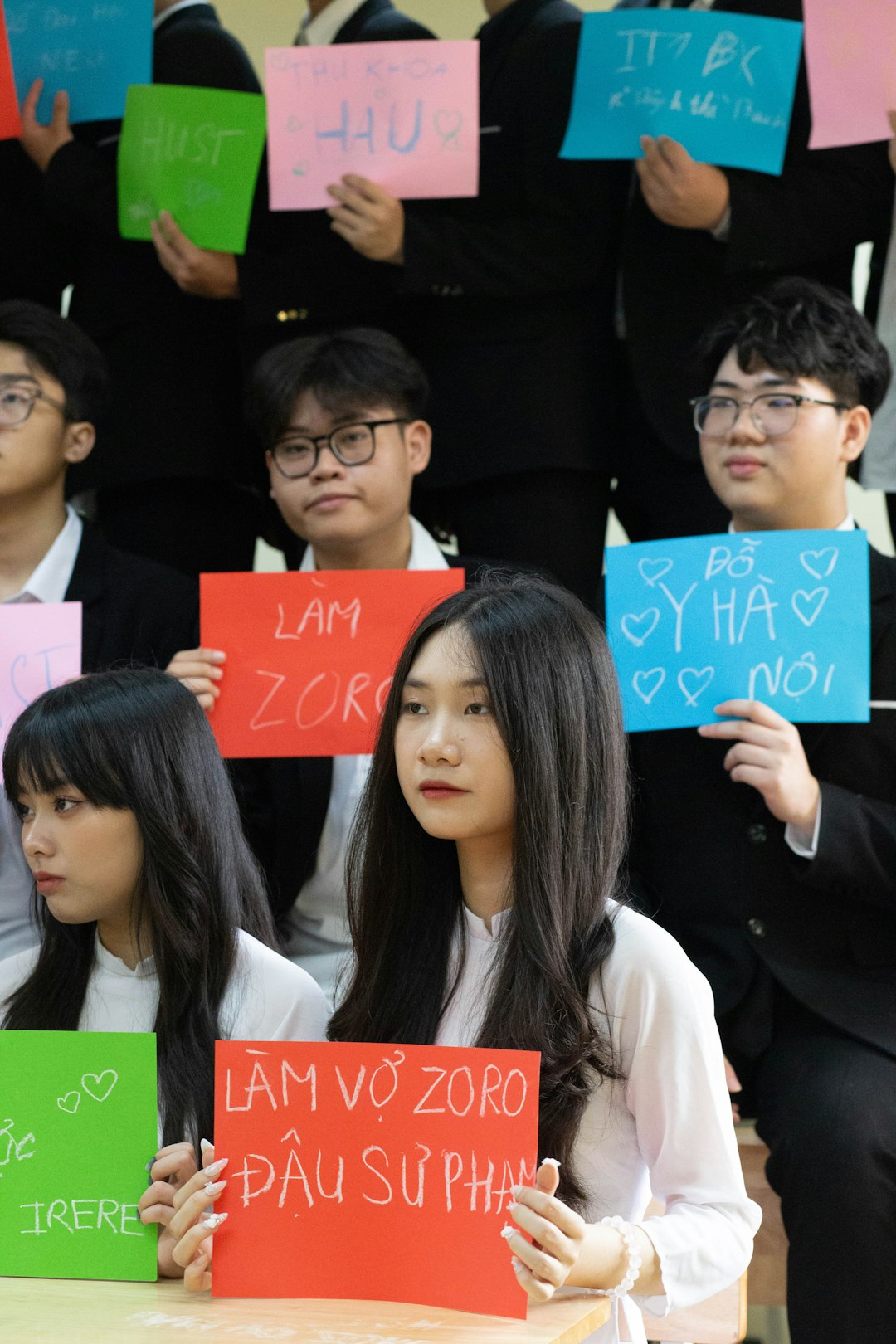
This striking combo is visually stimulating and perfect for capturing a youthful energy. Electric blue provides a sleek, modern base, while hot pink offers a pop of fun and flirtatiousness. Often associated with pop culture and music festivals, this palette works wonders for event flyers and party promotions.
2. Mint Green and Peach
Soft yet trendy, this pastel pairing is ideal for audiences who gravitate toward minimal aesthetics. It’s a great choice for lifestyle, fashion, or wellness flyers aimed at Gen Z. The soothing nature of mint green balances the warm playfulness of peach, making the overall design feel approachable and fresh.
3. Neon Purple and Chartreuse
If you want your flyer to scream “out of the ordinary,” this high-impact combination commands attention. This palette is reminiscent of streetwear and gamer culture, both of which are incredibly popular among younger demographics. Use black or dark gray as a background to make these colors pop even more.
4. Coral and Teal
Coral and teal strike a balance between energetic and cool vibes. These colors are highly versatile and can work for concert advertisements, art classes, or summer programs. The energetic coral draws the eye, while teal brings in an element of calm sophistication.
5. Black, White, and a Pop of Neon
This is a trendy and urban style combination that never goes out of fashion with younger audiences. The black-and-white base keeps the design sleek and professional, while the touch of neon—be it green, pink, or orange—adds that “wow” factor.
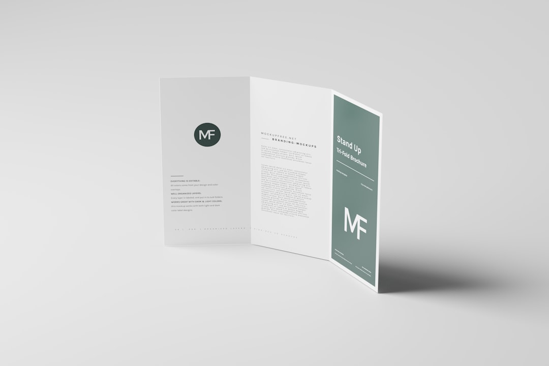
Tips for Choosing the Right Color Scheme
When designing a flyer with these color combinations, keep the following tips in mind:
- Know your audience: A flyer aimed at skaters might need edgier colors compared to a flyer for a yoga workshop.
- Test for readability: Make sure the text stands out against your background colors. High-contrast pairs help with that.
- Stay on-brand: If the flyer is for a brand or organization, use colors that align with the brand’s identity while keeping it fresh for a younger crowd.
- Avoid clutter: Too many colors can overwhelm. Stick to 2–3 main colors with accent shades when necessary.
Trendy Tools for Color Inspiration
Struggling to pick the perfect palette? Here are some online tools that can ignite creativity:
- Coolors – Generate and explore modern color palettes.
- Color Hunt – Curated collections of trending color schemes.
- Canva Color Wheel – Create harmonious combos based on color theory.
Conclusion
When targeting a young audience with flyer designs, the right color combination can be the difference between a flyer that ends up in the trash and one that gets snapped for social media. By using bold, energetic, and modern color palettes like electric blue with hot pink or mint green with peach, you can immediately connect with your audience’s sense of style and personality.
Stay current, keep experimenting, and always be willing to try out new color combinations to keep your designs fresh and exciting! Remember: when the colors click, the message sticks.

